
SOUMÉA
Brand Identity
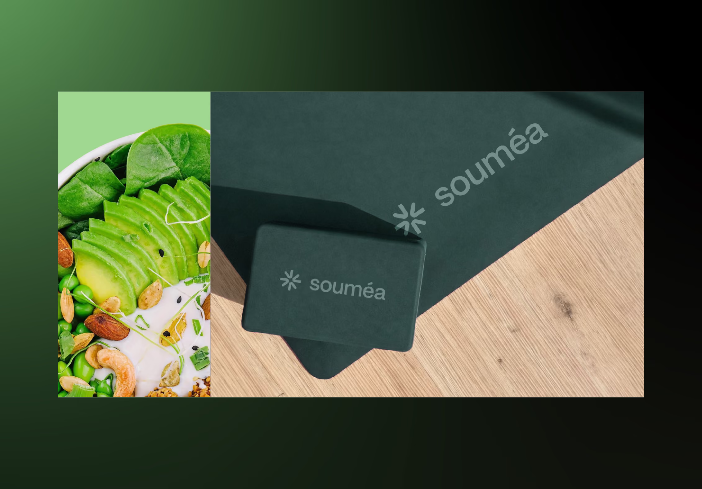
Souméa's visual identity conveys scientific credibility and warmth: deep, natural green tones with soft red and rosé accents create a balance between competence and warmth. Souméa positions itself as a reliable companion – grounded, empowering, and contemporary.
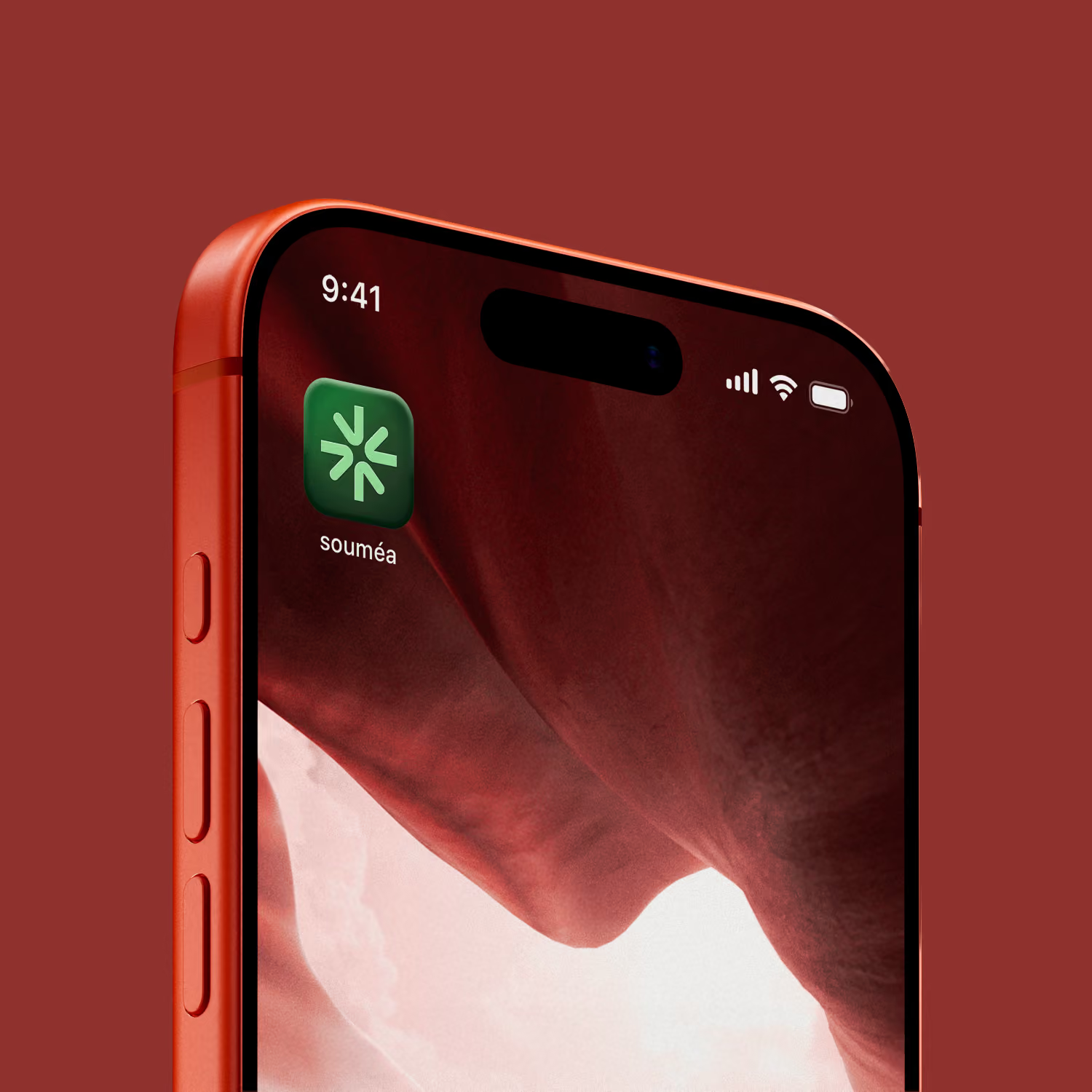
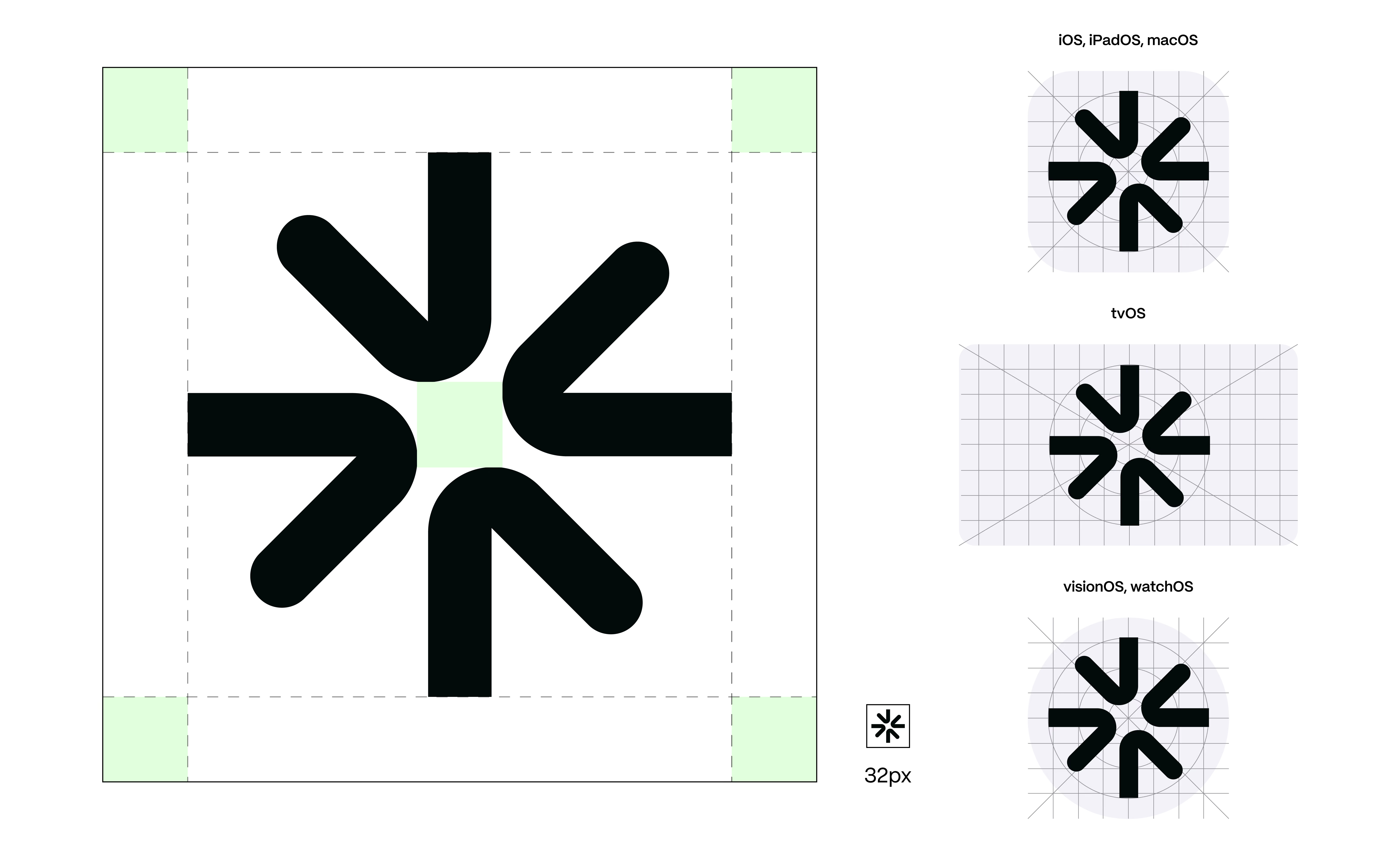
SYMBOL
The reduced logo symbol conveys the conceptual aspects of the app: several individual elements, deliberately brought together, form a new unity and thus a symbol of wholeness.
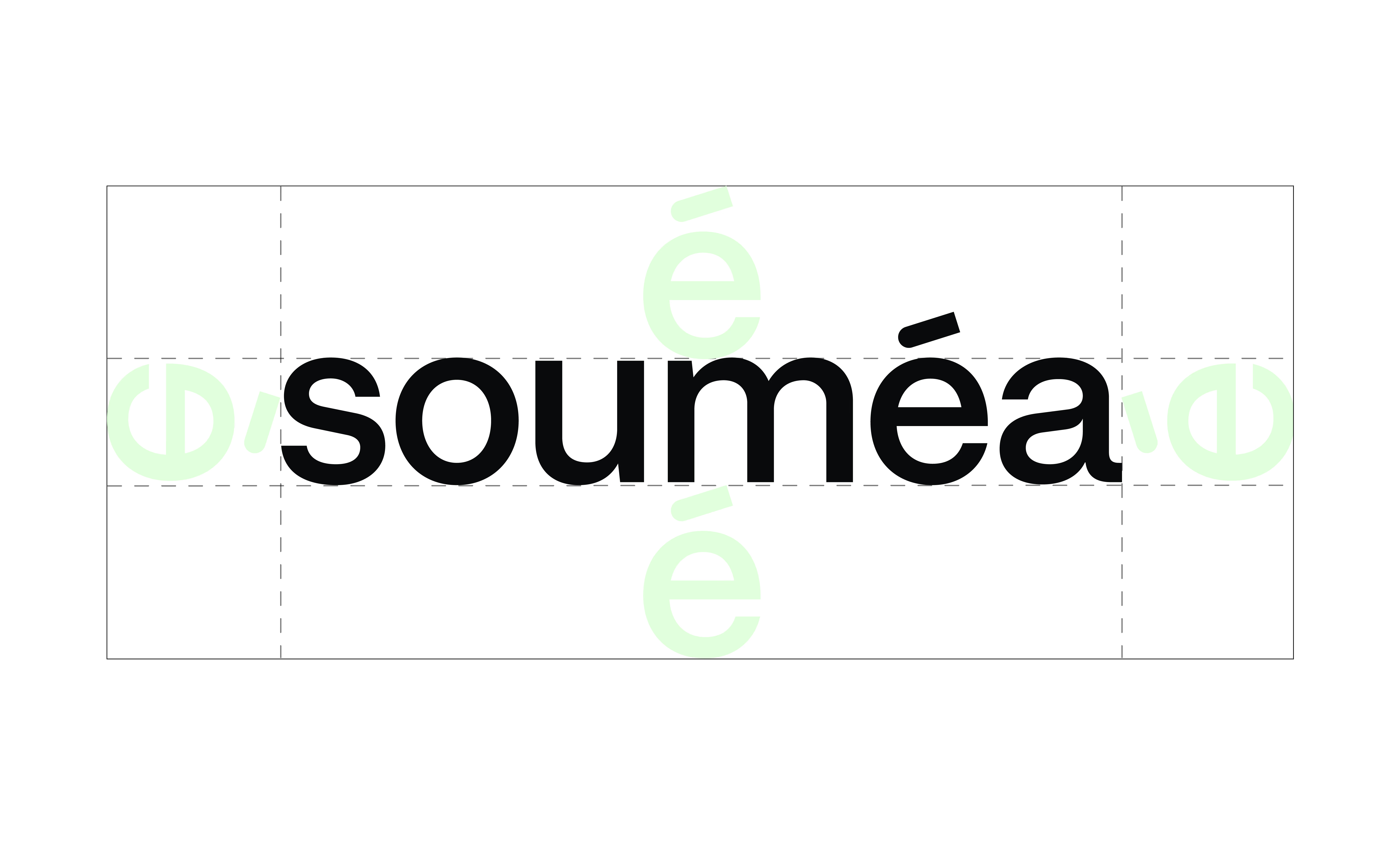
WORD MARK
The wordmark is based on PP Mori Semibold by Pangram Pangram and forms the typographic foundation of the logotype.
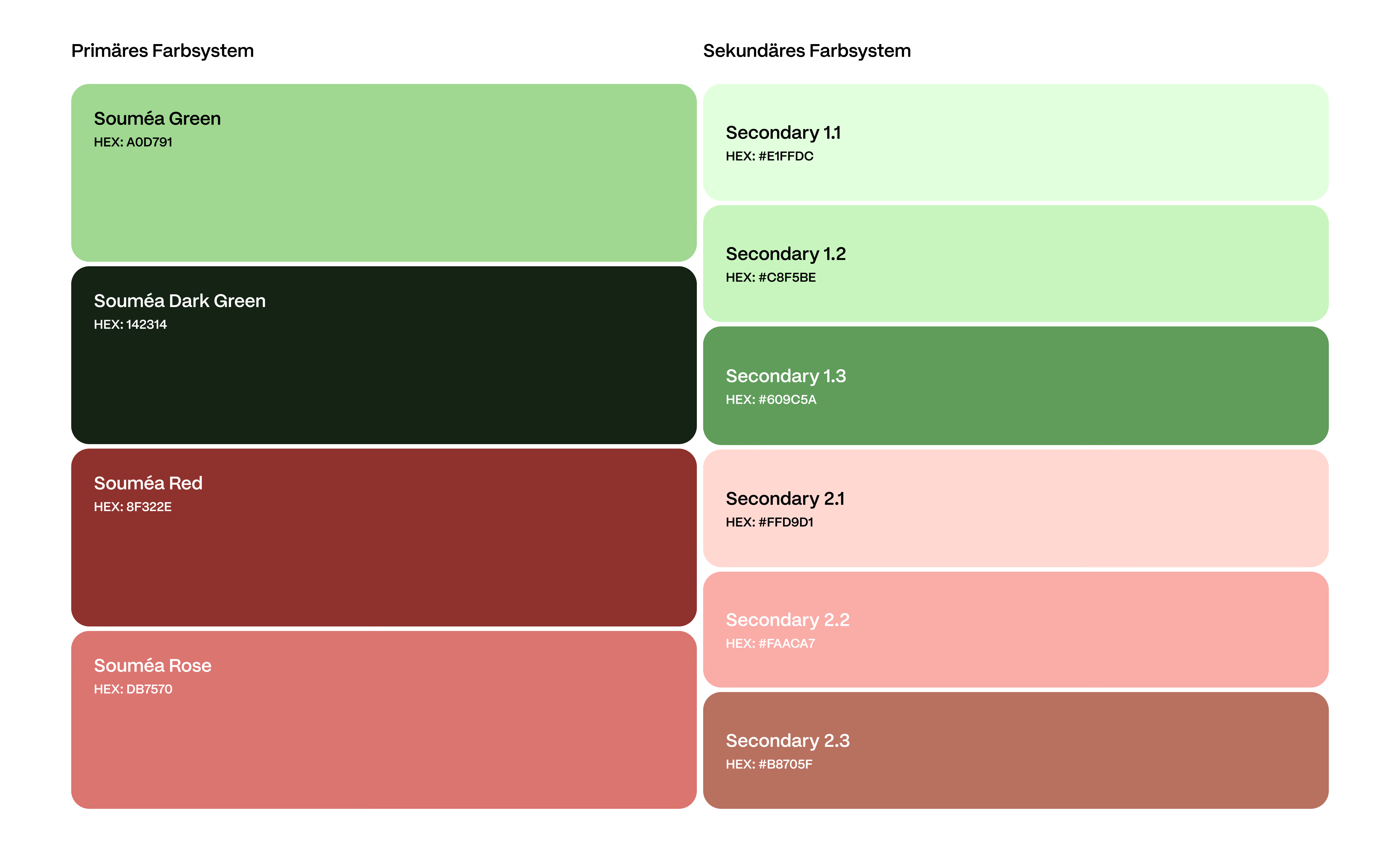
COLOUR PALETTE
The brand's color system is based on a clearly structured architecture of primary and secondary brand colors.

MEDICAL
From color architecture to persona and app-ready UI components, the system was designed to feel consistent, flexible, and trustworthy across every touchpoint.
NUTRITION
&WORKOUT
APP GUIDE
A structured design system document that translates the brand's visual identity into production-ready assets for app development.